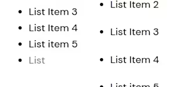
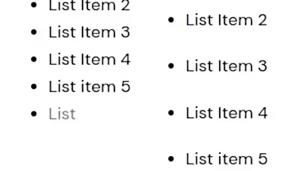
When your WordPress bullet point list looks too close together, the gap between entries must be expanded.
Having some space above and below each bullet point can make the page much easier to read and set each point apart from its neighbours.
It is quite a simple edit to make every bullet point list have a bit more breathing room, and you can fine-tune the breathing space each bullet point entry can have.
CSS
WordPress has a simple way to add CSS edits. These edits can be very powerful in altering the look and feel of your website. You can adjust with CSS, from colours to fonts to any element on the screen.
The CSS you need to make some space between the bullet point lists is:
.entry-content ul li {
    margin-bottom: 20px;
}
A straightforward bit of code can make a difference to your site. Easier to read the bullet point makes for happier visitors, and you get your point across better.
WordPress
To add the custom CSS to your WordPress, navigate the many to Appearance, then to Customize. from there, look for the Additional CSS menu. Click that to open the edit section. Paste the code above into the Customizing Additional CSS empty section. If some code is already in there, add it below the existing CSS edit.
Themes
Your theme will have a custom CSS entry section if the standard WordPress custom CSS isn't there or doesn't function. Check the theme control panel or help page for Custom CSS.
Adjustment
Change the number of px to adjust the spacing.
OK, maybe px is not ideal for a responsive world, so be free to edit the units if the mobile site looks bad but good on the desktop after testing. Let us know in the comments your enhancements to the solution above.
Genie
I search for the answers that the big search engine won't answer.